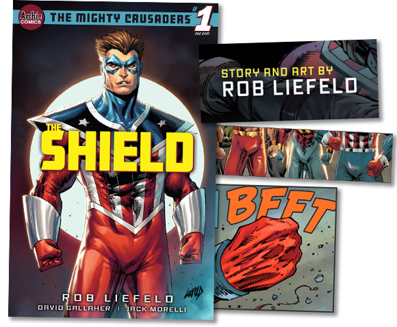
Last month of this very year, Archie Comics published The Mighty Crusaders #1: The Shield. It was a lifeless reboot of a 60-year-old knockoff superhero team, which isn’t as mean-spirited as it sounds since that describes most comics, but the reason we’re talking about it is because it was written and illustrated by Rob Liefeld. And it may very well be the most Liefeldian thing ever made, which is absolutely as mean-spirited as it sounds.
If you’re not familiar, Rob Liefeld was a comics illustrator from the ’90s who could sort of draw a few human parts and nothing else. Everyone noticed this, talked about it, and hated it, but they just kept letting him do it and here we are. The Shield’s second page shows a group of superheroes who look like they were mocked up this morning under the words “The Pinebrook Nazarene Youth Camp Super Duper Squad (Option Four).”
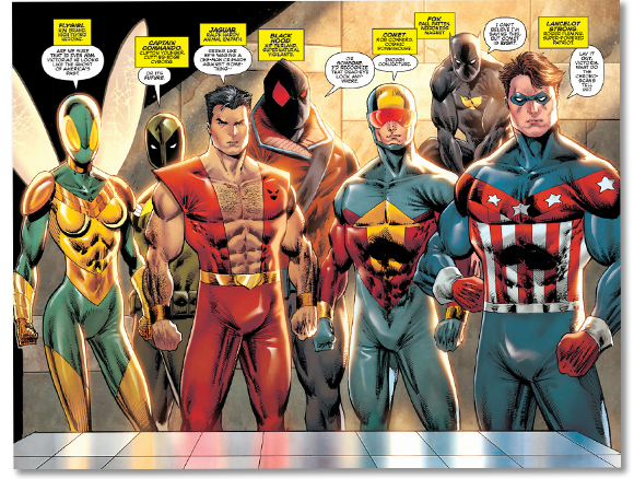
It’s okay if you don’t know the classic Archie heroes Flygirl, Captain Commando, Jaguar, Black Hood, Comet, Fox, and Lancelot Strong. They don’t do anything in this issue other than stand here hiding their difficult-to-draw feet behind their (maybe) office’s only furniture– a rectangle drawn by a 4th grader learning how to draw shapes. One hallmark of Rob Liefeld’s writing is that every character gets one small text box explaining which superhero archetype they are, no second part to this list, and then the comic gets cancelled.
Let’s talk about superhero archetypes for a second. Comic writers have been using them as shorthand for decades, and we’re fine with it. A character in a third party superhero world might run into a “clearly Batman guy” or “whatever their Fantastic Four is.” We don’t need to know everything about them; they’re just there to establish the setting so the author can show us his unique take on the genre. Rob Liefeld doesn’t do it like that. He thinks his idea of an 85th Captain America guy with no interesting twist totally rules. The Shield isn’t even his first “exactly like Captain America guy.” He was so good at drawing Captain America he produced a comic called Fighting American, who was a guy in a Captain America costume who carried a round shield.
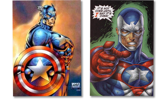
The Fighting American had a team just barely not called The Avengers with a guy named Smash who turned into a giant monster when he got angry and a viking god of thunder who doth verily spaketh like this. You probably believe me, but I feel like I should make it clear I’m not kidding:
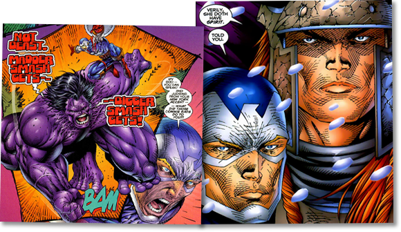
If you’re wondering how they got away with this, they mostly didn’t. They were sued and Fighting American was legally prohibited from throwing his shield which didn’t matter because the company went bankrupt and Rob created another Captain America called Agent America which also didn’t matter because lawyers told him to stop fucking making Captain Americas. Every entertainment industry blindly regurgitates the same idea over and over hoping it will work again, but it’s rare to see this pathology in one specific person. Which brings us back to The Shield, the (at least) fourth Captain America Rob Liefeld illustrated.
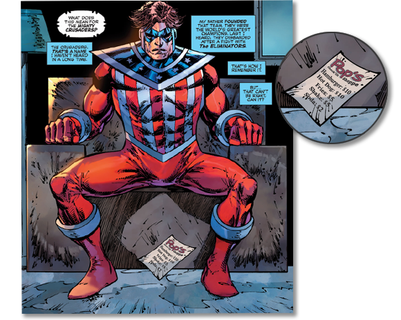
The Shield is in his (maybe) apartment, sitting alone on his rectangle. A hot dog menu levitates? Rob Liefeld, without exaggeration, one of the biggest successes in modern art and he has remained incurious about how to draw any single thing in 30 years. This chair’s existence is very much like if Richard Donner asked a makeup artist which side the camera things film from.
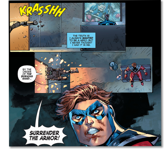
Because art is life, this world-famous illustrator drew The Shield watching a panel of himself from later in the comic on his TV. He lives in a cement box decorated with only a shape and a lamp, and yet even this was too much clutter for Rob to remember to draw the levitating hot dog menu.
Agents wearing the kind of shoulder pads Rob knows how to draw burst in through The Shield’s open window and knobless door! Chunks from unrelated objects follow them in! They’re here for his invincible armor and, wait did they say invincible armor, oh no, that explains why none of their weapons are going to work.
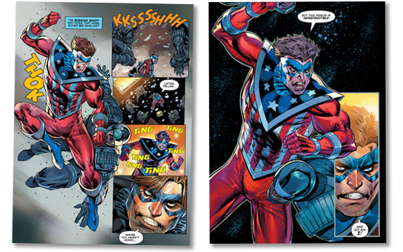
In stakes Rob Liefeld seems to think are high, these faceless agents from an organization we don’t know harmlessly shoot the superhero for reasons not made clear. He barely has to move to beat them, which is good because Rob thinks he knows how a human arm connects to a torso at this one angle. He’s wrong, but my main point is this isn’t storytelling. It’s something a bored nerd would look down at during Algebra class and not really remember drawing.
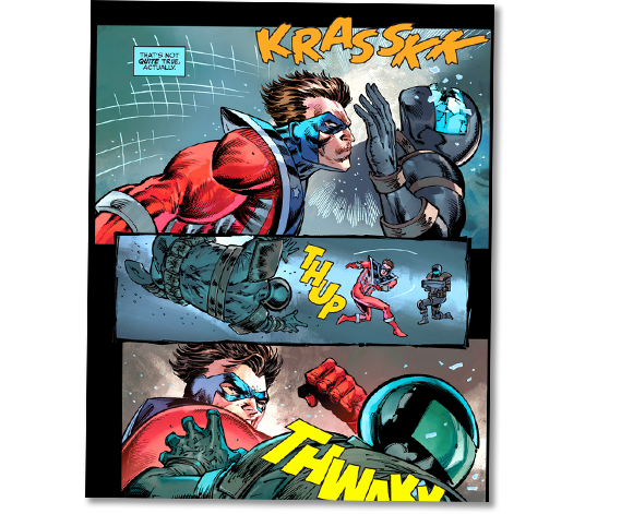
Rob seems to have lost track of shit himself. The Shield brags about how he is super duper like his suit, explains to the reader how no he’s not, then headbutts and punches through everyone’s helmets with what is clearly super duper strength. Maybe? We’re not told what their hats are made of. They’re not quite motorcycle or SWAT helmets– they’re more like what you’d draw if you were an untalented artist falling off a bridge and almost had time to draw one last human head. Anyway, over the course of five pages of low effort storyboards for a Ugandan kung fu movie, we are told and shown several contradictory things about our main character while learning nothing about anything. It’s magnificent. If you showed this to the kindest comics editor in the world, they would say, “Tell the kid who drew this they should maybe be a fucking dentist.”
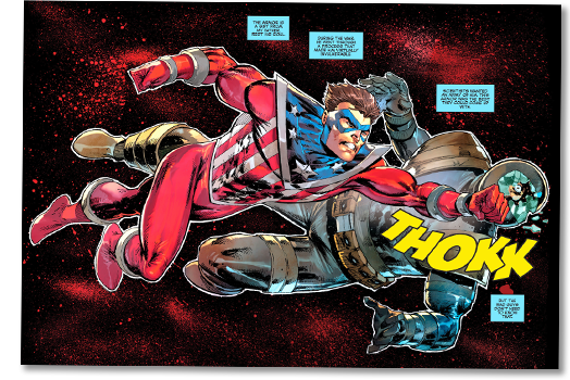
This goddamn fight is still going. He punches one guy so hard they leave the confinement of his 3000 square foot cement box apartment and land on a Frank Miller spatter paint background. If you were to interpret this as real art, you’d say it was revealing something about a dark brutality within this hero. But it’s not that. This art says nothing more than “I didn’t know how to draw The Shield’s love seat from the side.”
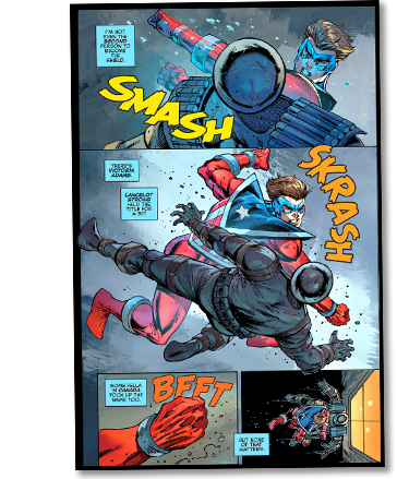
Jesus Christ, he is still handing out this one-sided beating while he thinks the Wikipedia entry for The Shield to himself.
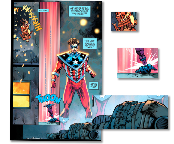
After maiming whoever these men were, he rides one of them out the window. It’s not clear what floor he’s on, but his building is a mid-century cement rectangle in the city’s Gray Nothing District. There’s something more amazing happening here, though. Rob Liefeld is known for his reluctance to draw feet, and it’s almost genius how he managed to hide The Shield’s feet three different times on a single page. He had to savagely murder one cop(?) to do it, but there it is– a master at work.
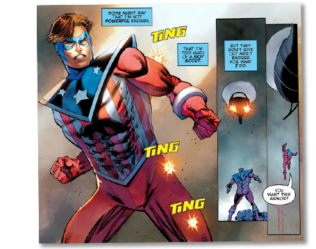
It’s not over! The Shield gets shot a few times by a Pictionary drawing that was going to be a helicopter, so he leaps up onto it. Which means, wait, mounted aircraft guns don’t even jostle him? And they sent in eight(?) dudes in egg carton helmets to take him down with small arms? Holy shit, do I know more about helicopters than Rob Liefeld?
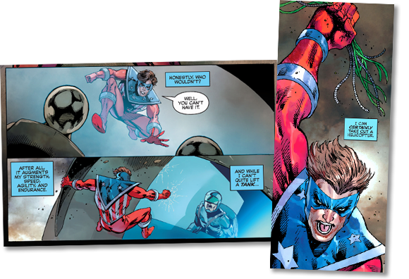
I’m being silly. Rob Liefeld knows parts of the helicopter I couldn’t even conceive of. Like how The Shield is clinging to the helicopter’s… I guess you’d call it its dorsal fin? Then he reaches into the windshield, pulls out its important wires, and raises them up above his head. I have no notes about raising your hands while you’re on a moving helicopter’s windshield and can’t think of a single very specific thing Rob Liefeld is forgetting about helicopters.
You know what? This all seems weirdly familiar like I’ve seen it before. And not in the usual Rob Liefeld way. I mean a Captain America guy spending entire pages beating the fuck out of a room full of government(?) agents… that’s from Civil War, the extremely popular Marvel comics event they based a billion dollar film on. Here, I’ll show them side-by-side:
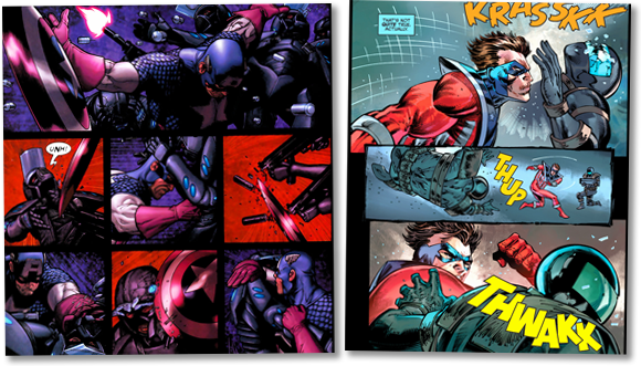
The similarities end there, though. It’s not like in Civil War, Captain America jumped out the window and punched through the windshield of a helicopter. It was a jet.
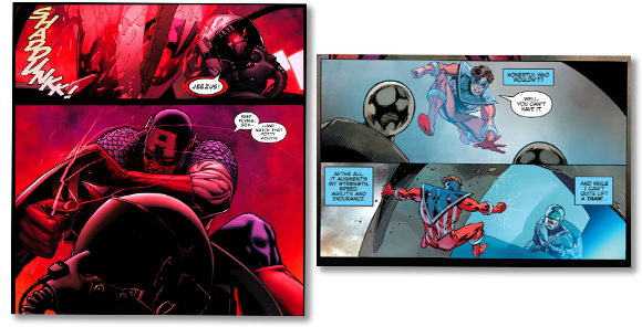
Obviously I’m not accusing internationally known haver-of-original-ideas, Rob Liefeld, of plagiarism. There are still some major differences between these two sequences. For instance, The Shield was attacked in his apartment and Captain America wasn’t. But wait, oh no, I just remembered Luke Cage’s scene in Civil War.
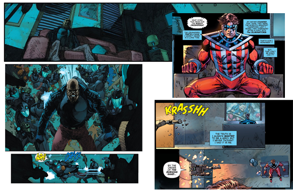
Oh fuck, I think that rectangle graveyard might have even been Rob trying to draw Luke Cage’s couch from a less interesting angle. So look, maybe it wasn’t on purpose that Rob Liefeld did a shot-for-shot ripoff of one of the most well-known comic events of the last fifteen years. But whether he knew it or not, something inside him said, “Let’s do exactly the thing everyone saw, only again, and worse in every way. Again.”
Oh, this must have saved him a few minutes. The page after the helicopter crash is just a The Shield pin-up.
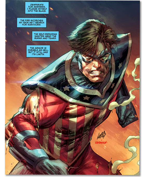
Since it’s just a quick sketch of The Shield standing near the color orange, Rob has to explain in the text box that he is searching through the wreckage of his tenth(?) recent murder “for survivors.” If you’re wondering if it’s normal for a comic to do this -describe all the action because it’s faster than drawing it- no, it’s not.
Another hallmark of Rob Liefeld’s art is frantic nonsense instead of anatomy or design. It’s why the plain concrete walls of The Shield’s building have random cracks and bricks(?) every few feet, or why his indestructible costume suddenly has a bunch of super cool battle damage. Wait, oh yeah, fuck, indestructible costume. Well, no worries, they can add a text box explaining it has, I don’t know, “limits” and “self-repairing nanites” now. What I’m getting at is that Rob Liefeld will rewrite an entire character and his origin story if it gets him out of forty seconds of work.
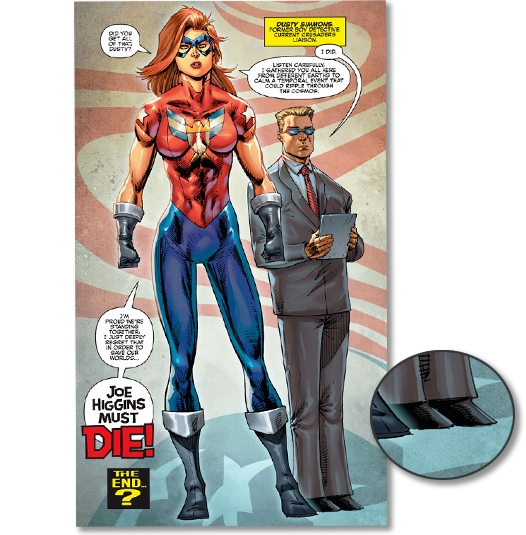
The comic ends with all the superheroes voting to kill The Shield including this lady version of a Captain America guy. Like many Rob Liefeld drawings, it’s hard to tell if Dusty Simmons, “former boy detective current Crusaders liaison,” is three feet tall or if Rob’s brain made some kind of mistake during its understanding of perspective. It probably doesn’t help that they are standing on nothing in a dimension made only of primordial America.
There’s one more thing to talk about. Obviously, I’d never claim a comic was Maximum Liefeldian without another important aspect of Rob Liefeld’s work: petty, stupid behind-the-scenes drama that leads to him leaving the project.
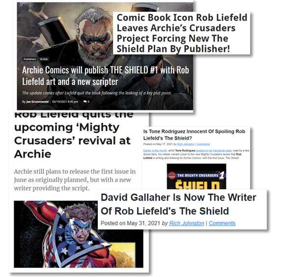
Apparently, Rob was furious when an alternate cover by Tone Rodriguez was “leaked.” It revealed the surprise that would have shocked The Shield’s longtime fans*! A version of The Shield from the future, a big gun-carrying one, was going to come back to the current The Shield’s time! That’s right, the guy known for creating Cable and also the same things over and over, created Cable again!
* ha ha
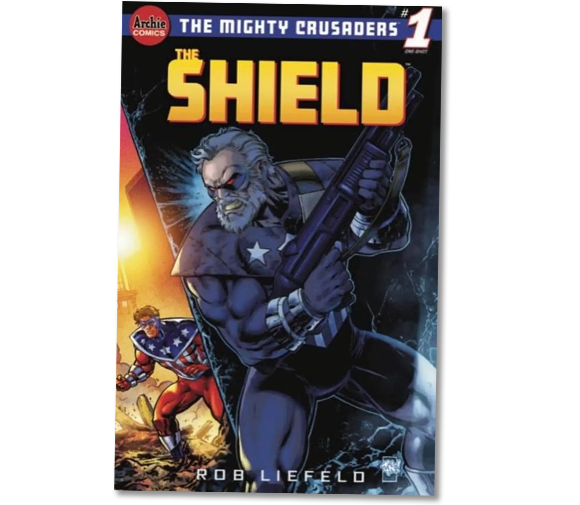
What’s great is that an image of Old Gun The Shield was already being circulated in promotions for the comic for months. And the first page of this issue I’m talking about, the very first page, has a picture of him, battle-damaged indestructible suit and all:
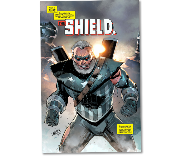
It’s not a sudden twist at the end! Even assuming you had any expectations for whatever the fuck a The Shield story might be, knowing an old time-traveling version of him was going to show up only spoils the brief moment between picking up the comic and opening it. And Rob Liefeld quit over it! That’s like walking off the set of Transmorphers 2 because the first one’s DVD box told everyone it was 86 minutes long. There is nothing more Rob Liefeld than abandoning a knockoff Captain America comic after drawing eight lazy splash pages, one foot, and even fewer backgrounds. Even trying to imagine something more Liefeldian would risk shattering our reality and L-Liefeld Liefeld Rob Liefeld Liefeld. Liefeld. Rob Liefeld.

…
This article is brought to you by our fine sponsor and Hot Dog Supreme, TheLaziestManOnMars: Who comes complete with katana, shoulderpads, beltpouches, and couch rectangle. Feet not included.

13 replies on “Nerding Day: The Shield 🌭”
this one is real good
I get that some artists would rather draw boffo action sequences instead of backgrounds, but it’s notable that NONE of the images above feature any kind of thoughtful background—everything happens in a color block. And yes, his anatomy is terrible—25 years and he still hasn’t figured out what abs are—yet he’s still making comics. It’s bizarre.
I have to make a correction or it will torture me. Agent America was actually “created” before Rob’s version of Fighting American came out. Joe Simon had asked for more money to license Fighting American than Liefeld was willing to pay, so Liefeld just used the same character design for his “new” character, Agent America. Simon then threatened to sue but it was cheaper to just license Fighting American for less money. And that’s one to grow on.
Taking a knowing risk, I googled “Rob Liefeld feet” and found that he can actually, kinda, draw bare feet, as seen here:
https://bleedingcool.com/comics/rob-liefeld-drawing-feet/
My theory is that he used his own very wide hobbit feet as reference, which is why he can only draw them as seen from above. And I’m convinced the reason he can’t draw feet in shoes is because he doesn’t wear shoes indoors, and putting on a pair, standing in front of a mirror, and seeing what they look like from the front, is more effort than Liefeld has ever put into anything.
Also, The Shield uses his face for headbutting. That’s pretty hardcore.
…I miss the pouches.
No joke, Rob Liefeld’s art is the reason I stopped reading comics in the 90’s.
Those torsos have mustaches.
Has no one ever told Liefeld that people’s abs don’t go up to their clavicles?
All I can think of is Strong Bad’s Ab Abber 2000
Ok, but is the story good?
Well I’ve only seen the few panels Seanbaby posted in this article, but I feel like I can confidently say, “No, no it is not.”
To be fair to the comics industry, and to aim a quick right to the back of Eob’s knees, the Shield and Fighting American weren’t even his creations.
The Shield, as Seanbaby mentions, is an Archie property that has bounced around publishers for decades, with varying degrees of utter failure. The Fighting American, on the other hand, was a created in the 50s by Jack Kirby and Joe Simon, i.e. Captain America’s creators (but not owners because comic book i.p. rights are an unforgiving hellhole), SPECIFICALLY because they thought the Captain America book Timely/Marvel were making SUCKED. And he didn’t even carry a shield! Rob the Knob here took a perfectly distinct and original spin and made it MORE illegal because he wanted to draw Cap in the same style that people were consistently mocking when he was at Marvel! He’s so thoroughly committed to doing art that nobody likes, it became a legal issue!
Liefeld is awesome! I suppose I might care about him repeating stuff and not having backgrounds or feet or stuff if I had object permanence, but I don’t! Whose cell phone is this?
It’s said that to succeed in comics, you have to be two out of three things: good at your job, fast at your job, or pleasant to work with.
Rob Liefeld is 0 out of 3 and has somehow had a successful 30+ year career.